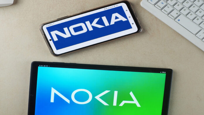
On Sunday, 26th February, Nokia changes its iconic logo for the first time in 60 years. The new logo is designed to reflect the company’s current brand strategy and its focus on the future of technology.
Nokia’s original logo was created in 1959 and has remained unchanged for six decades. The classic blue and white logo was instantly recognizable and symbolized quality, reliability, and innovation.
However, with the rise of new technologies and the changing needs of consumers, Nokia realized that it needed to update its brand to stay relevant in today’s fast-paced digital landscape.
The new symbol includes five different shapes creating the word NOKIA changes. The iconic blue shade of the old logo has been changed for various colors relying on the use. It represents the company’s sustainability commitment and dream of a more interconnected and sustainable planet. The new font is clean and modern, reflecting the company’s focus on simplicity, clarity, and user experience.
Pekka Lundmark, Chief Marketing Officer at Nokia, said, “We wanted to create a logo that represents our modern, digital-first brand while paying homage to our heritage and the iconic logo that has served us well over six decades. Our new logo reflects our commitment to innovation, simplicity, and sustainability while staying true to our roots and the values that have made Nokia a trusted brand for generations.”
The new logo is created as part of a more significant brand refresh that aims to position Nokia as a leader in the digital transformation space. The company has been working on expanding its product offerings beyond traditional mobile devices and into new areas such as 5G networks, cloud computing, and the Internet of Things.
With this new brand strategy, Nokia hopes to connect people, businesses, and communities in new and innovative ways while driving sustainable growth and social responsibility.
The response to Nokia’s new logo has been mixed. Some praised the updated design, saying it reflects the organization’s dedication to creation and sustainability. Others have criticized the change, arguing that the classic blue and white logo was an iconic symbol of Nokia’s heritage and that the new design lacks the same impact and recognition.
Related Search: Best Mobile Phone Brands in India
However, most experts agree that Nokia’s decision to update its brand is smart. In today’s fast-paced digital landscape, organizations must be keen to develop and acclimate to stay relevant. By updating its logo and brand strategy, Nokia is ready to embrace change and take risks to succeed in the long term.
Nokia’s new logo symbolizes a substantial evolution for the company and an exciting new chapter in its history. With its focus on innovation, simplicity, and sustainability, Nokia is well-positioned to continue driving technological advancements and positively impacting the world for many years.


